Why Charts Actually Matter
Imagine trying to drive without looking at the road. That’s what trading is like without charts. Sure, some people rely on news headlines or gut instinct, but price action tells the truth.
Charts are simply a record of what buyers and sellers have already done. They don’t predict the future like a crystal ball, but they give you context. A quick glance can tell you: Is this asset trending higher? Are people hesitating? Is volume spiking? That context is priceless. So, that’s why we use charts and candles.
The Basics: What a Chart Really Shows
Every trading chart boils down to three elements:
- Price: how much something is worth at a given moment. Price is simply how much an asset (say Bitcoin or Solana) is worth at a given moment. But it’s more than just a number. The price reflects the tug-of-war between buyers and sellers at the moment. If the price is rising, it means buyers are more aggressive; if it’s falling, sellers are taking control.
- Time: when that price was recorded. Every data point on a chart is labeled with the date and time it occurred. That’s what creates the horizontal axis of the chart. Whether it’s a one-minute candle or a weekly bar, timeframes change the story you see. Zoom in, and you catch the market’s short-term jitters. Zoom out, and you see the broader trend.
- Volume: how many people were involved in the trade. Volume shows how many units of an asset were traded in that period. High volume? That means a lot of players are involved, and the move weighs it. Low volume? It might just be a few traders nudging the price around.
Different chart types display this information in different ways. Line charts connect closing prices with a simple curve. Bar charts show more detail with highs and lows. But candlestick charts dominate, so for good reason.
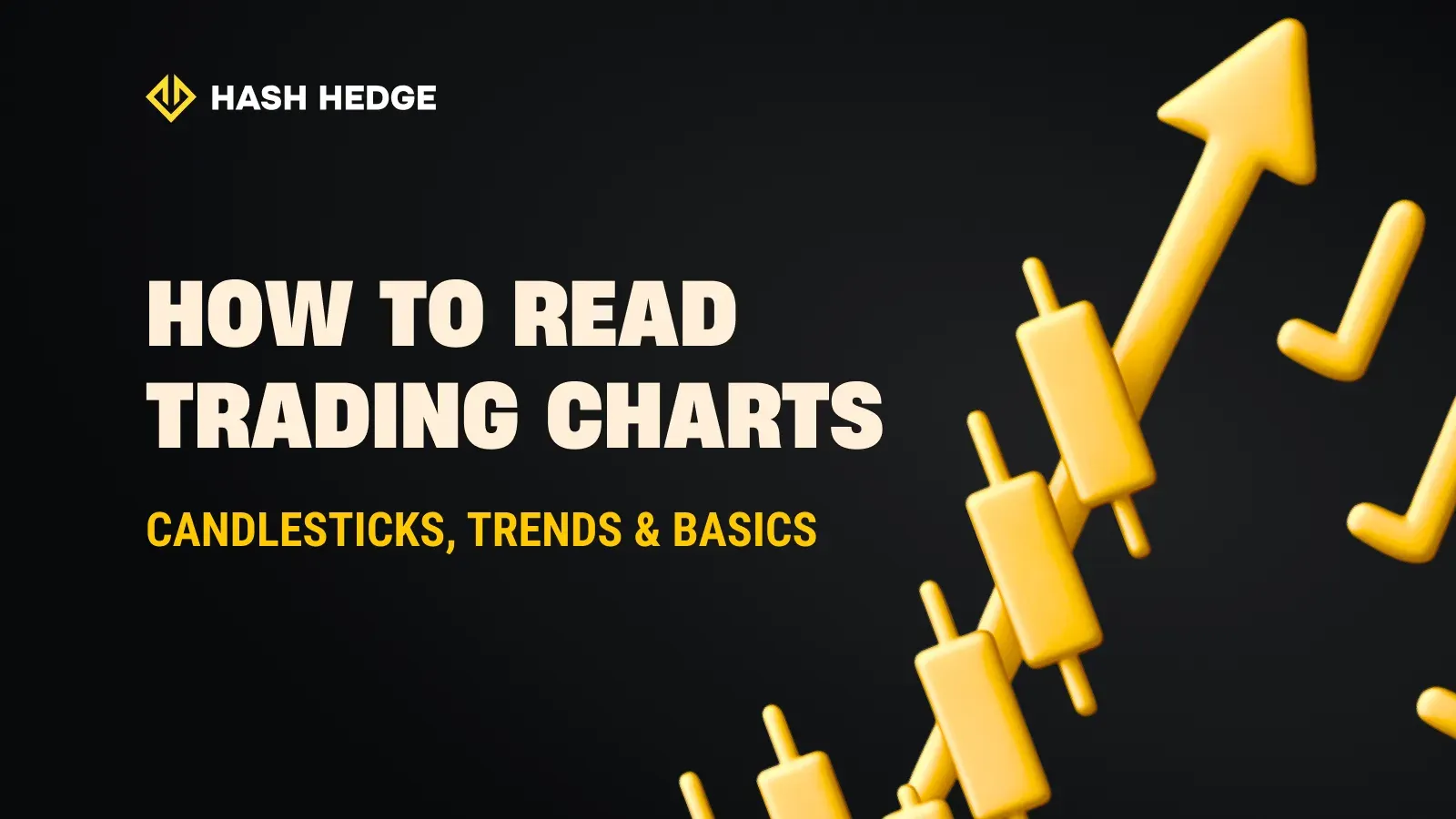
Candlesticks
A candlestick is a miniature story.
- The body shows the opening and closing prices.
- The wicks (or shadows) show the extremes: the highest and lowest prices during that time.
- The color signals direction: green (or white) for up, red (or black) for down.
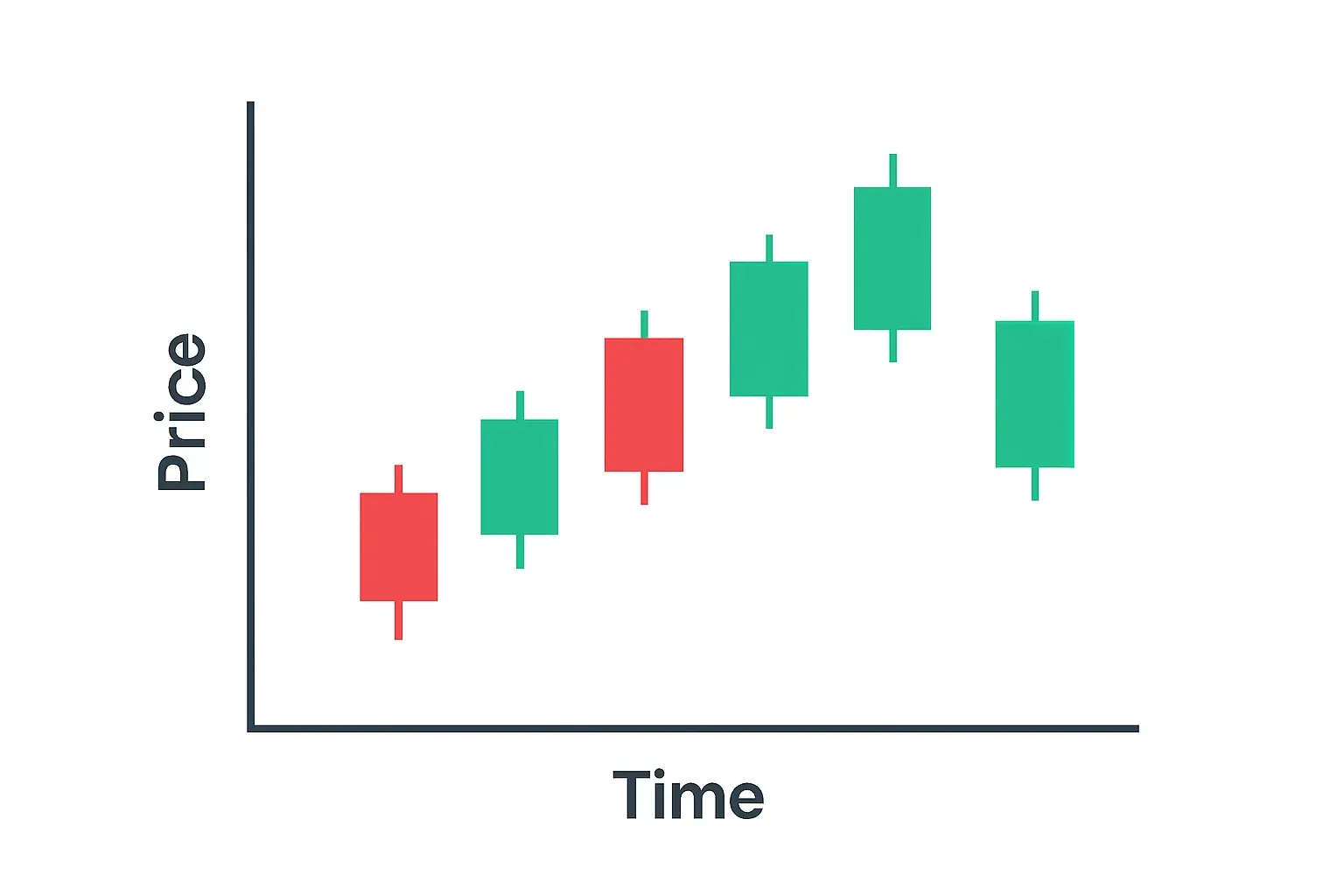
One candle alone isn’t a novel. But a cluster of them? That’s market psychology. There are thousands of candlestick patterns, so it’s hard to learn them and use them in play. Here are some classic candlestick signals:
- Doji. When the open and close are nearly the same. It screams indecision.
- Hammer. A small body with a long lower wick: buyers pushed back after sellers tried to drive the price down.
- Engulfing. When one candle fully swallows the previous one, often hinting at a reversal in mood.
Think of each candle like a tweet from the market. Individually short, sometimes noisy. Together, a timeline of sentiment.
Spotting Trends Without Overthinking
Trends are the heartbeat of trading. An uptrend simply means higher highs & higher lows. A downtrend means the opposite. Sideways movement? That’s a market catching its breath.
Visualizing it helps:
- Uptrend = like a staircase going up.
- Downtrend = like sliding down a hill.
- Sideways = walking on flat ground.
You can also draw trendlines to make sense of it. Connect two or more highs in a downtrend or two or more lows in an uptrend, and you’ll see the market’s “path.” Channels take this a step further, showing both the top and bottom of a price range.
Must-have: Trading with the trend is usually easier than fighting it.
Support and Resistance: Invisible Floors and Ceilings
Every trader eventually discovers these invisible barriers.
- Support is like a floor: a price level where buyers consistently step in.
- Resistance is like a ceiling: a level where sellers keep pushing back.
Markets often bounce between these zones. Why? Because human psychology repeats. When traders see a price hold or reject multiple times, they react accordingly. That repetition makes support and resistance some of the most reliable concepts in chart reading.
Timeframes: Different Lenses, Different Stories
Here’s where things get tricky: the same chart can look bullish on a daily view and bearish on a five-minute view.
Short-term traders (scalpers) focus on minute charts, chasing quick moves. Swing traders might use daily or weekly charts. Long-term investors zoom out to monthly timeframes.
| Timeframe | Who Uses It | What They Look For | Description |
|---|---|---|---|
| 1-5 min | Scalpers | Quick moves, volatility | High-frequency trades, fast decision-making, react to tiny price changes |
| 1H-4H | Day Traders | Intraday opportunities | Open and close positions within a day, moderate analysis, follow news and patterns |
| 1D-1W | Swing traders | Medium-term trends | Hold positions for days/weeks, trend-focused, balance risk and reward |
| 1M+ | Investors | Big picture, long-term view | Focus on fundamentals, patient, less affected by short-term volatility |
Think of it like Google Maps: zoom in, and you see streets and turns. Zoom out, and you see entire countries. Both perspectives matter—but the bigger picture usually has the final say.
Volume and Indicators: Extra Layers of Clarity
Price reflects what the market is willing to pay; volume reveals the strength behind that movement. When a price rises accompanied by increasing volume, it signals strong participation and conviction. Conversely, a rising price on declining volume suggests weaker support and a move that might not sustain. Volume helps you separate genuine trends from short-lived spikes.
On top of this, traders use indicators as “filters.” A few beginner-friendly ones:
- Moving Averages (MA). Smooth out fluctuations to reveal the prevailing direction. They help identify support and resistance zones without overcomplicating the chart.
- Relative Strength Index (RSI). Measures the speed and change of price movements to indicate potential overbought or oversold conditions. It helps spot when a reversal might be approaching.
- MACD (Moving Average Convergence Divergence). Combines trend and momentum information to highlight shifts in market direction. It’s useful for timing entries or exits.
| Indicator | Primary Use |
|---|---|
| Moving Averages (MA) | Reveal overall trend direction, identify support and resistance zones |
| Relative Strength Index (RSI) | Detect overbought or oversold conditions, anticipate potential reversals |
| MACD | Track momentum and trend shifts (Convergence Divergence), time entries, and exits |
Here’s the catch: don’t drown your chart in indicators. Too many, and you’ll paralyze yourself. Simplicity works better.
Most traders are limited by the rules of other platforms. At Hash Hedge, you choose the assets, decide the approach, and we back you with real capital up to $100,000.
Putting It All Together: A Practical Example
Let’s say you open a chart. How would you apply everything above? Save this list for later:
- Pick your timeframe: daily chart for context.
- Spot the trend: higher highs, so the market is trending up.
- Mark support and resistance: maybe $105K as support, $110K as resistance.
- Read candlesticks: you notice a bullish engulfing candle forming at support.
- Check volume: volume is rising on the bounce.
- Plan your trade: you decide to enter near $106K with a stop below $105K.
Final Thoughts: From Chaos to Clarity
Reading trading charts isn’t easy. Every candlestick feels like noise at first, and it takes time before you see the rhythm behind the chaos. But with practice, you stop guessing and start reading patterns and psychology.
Learning always comes with mistakes, so mistakes usually cost real money. That’s why platforms like Hash Hedge are changing the game: we fund traders with up to $100,000 across 160+ crypto pairs, so you can sharpen your skills, trade serious size, and grow without putting your own savings on the line.
You focus on the trade — we provide the capital.